


Football fans are very passionate when it comes to supporting their teams, and there is nothing that binds a club more with its fans than its logo and colours.
A logo is a visual representation and the first thing that comes to mind about a club; a symbol which unites and builds emotional ties.
It is for these reasons companies spend thousands of dollars on branding when it comes to creating a new logo or updating an existing one. While a logo in and of itself does not guarantee success on the pitch, there is no denying of its importance off the pitch especially for marketing and merchandising.
In this article I put aside my Milan bias and look at each of the Serie A team logos and rank them purely on aesthetics (design, colours, clarity, to name a few). I will also explain the meaning of the logo. This is purely subjective and as the saying goes, “beauty is in the eye of the beholder.”
Serie A Logos Ranked
| Rank | Logo | Nicknames | Analysis |
| 20 |  Sampdoria Sampdoria |
Il Doria La Samp Blucerchiati |
The logo is composed of a crest with the blue, red and white team colors, with a black silhouette of a sailor, the symbol of the port city. However the sailor who is supposed to have wavy hair and smoking a pipe looks like blob of spilled ink. |
| 19 |  Crotone Crotone |
Pitagorici Squali Rossoblu |
The oval of the Calabrese club displays the team name with its blue and red colors. In the middle in a white block (why not make it transparent?) appear two sharks and a triangular pennant containing the coat of arms of the city against a backdrop of red and blue stripes. Too busy and you need binoculars to grasp that. |
| 18 |  Empoli Empoli |
Azzurri | Empoli’s logo of a blue shield with interlocking letters is unclear and the letters look scibbled together. At the bottom is the club’s year of foundation. |
| 17 |  Chievo Chievo |
Gialloblu Mussi Volanti |
The flying donkeys have a blue and yellow crest, their name and year of founding along with medieval lord of Verona, Cangrande I della Scala. Interior too yellow for my liking. |
| 16 |  Juventus Juventus |
Vecchia Signora Bianconeri Le Zebre |
Gone is the traditional crest (which was very nice), replaced with a simplistic J with a shield beside it. With these two simple lines Juventus is trying to appeal their brand beyond football – doubt it will work, fans are loyal to the club not the logo. Too minimalist for my liking. |
| 15 |  Udinese Udinese |
Friulani
Zebrette |
A white shield with black echelon (symbol of Udine) pointing up is embedded in a grey circle surrounded by golden branches. The white on grey is too light on the eyes. |
| 14 |  Pescara Pescara |
Biancazzurri
Delfini |
The Abruzzo club affectionately makes the dolphin it’s symbol for this city on the Adriatic sea. The colors blend well but the dolphin seems too cartoonish. |
| 13 | 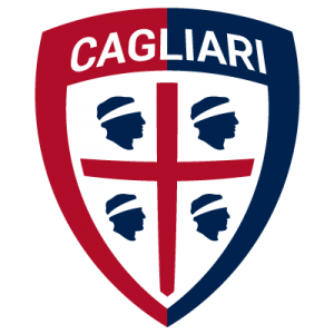 Cagliari Cagliari |
Isolani
Rossoblu |
The logo was inspired by the symbols and colours of the Sardinian city; red and blue, and the four moors facing the right with bandage on their heads. Clean look but would have preferred a single color shield border. |
| 12 |  Sassuolo Sassuolo |
Neroverdi
Sasòl |
The club from Modena is the only one that has a soccer ball in their logo, which is a bit tacky. The crest features the team colors green and black, on the upper left the three hills of the city and on the right the kit stripes. |
| 11 |  Napoli Napoli |
Partenopei
Azzurri |
Napoli’s logo is simple yet elegant, a white N in a light blue circle with a darker blue border decorated with a shade and lighting effect. The font of the N could have been something other than times new roman. |
| 10 |  Inter Inter |
Nerazzurri La Beneamata Il Biscione |
Football Club Inter Milan – white FCIM letters interlock in a circle surrounded by a black border and another blue border. Colors blend well but too many interlocking letters for my liking. |
| 9 |  Atalanta Atalanta |
Orobici
La Dea |
An oval logo featuring a mythological Greek Goddess comes together nicely against a blue and black background. |
| 8 |  Bologna Bologna |
Rossoblu
Felsinei |
The oval crest combines the red and club stripes of the club on the left and a cross on the right, and team initials on top. Polished look. |
| 7 |  Palermo Palermo |
Rosanero
Aquile |
A shield incorporating a golden eagle with open wings with a background of pink and black, love how it all comes together. |
| 6 |  Lazio Lazio |
Aquile
Biancocelesti |
Continuing my fascination with golden eagles, Lazio’s eagle resting on top of a shield ready for takeoff catches my eye for the logo with the most original shape. |
| 5 | 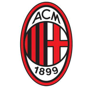 Milan Milan |
Diavolo
Rossoneri |
Milan’s red and black logo wins the award for best oval crest. Similar to Bologna (stripes on left, cross on right) however prefer the round circle in the oval style. |
| 4 |  Fiorentina Fiorentina |
Gigliati
La Viola |
There is a certain je ne sais quoi about a red fleur-de-lis of Florence in a kite shaped crest with gold border that makes this logo so unique. |
| 3 |  Genoa Genoa |
Grifoni
Zena |
Nothing spells royalty like the mythological griffon (combination of a lion and an eagle) coupled with a shield half red half blue and a cross on top. |
| 2 |  Roma Roma |
Giallorossi
Maggica La Lupa |
Roma’s crest, incorporating its city’s founders – twin brothers Romulus and Remus, suckling from the she-wolf “La lupa” is gorgeous against the half maroon red and half golden yellow shield. |
| 1 |  Torino Torino |
Il Toro
I Granata |
The rampant bull, symbol of Turin, in a maroon shield reminds me of the Ferrari stallion and gets my vote for best logo in Serie A. |


